
Is your home in need of a refresh? Looking around, there’s so much colour everywhere from which to draw inspiration. Where do we start? This year, the 2026 colour palette from Pantone is here, and it is one of our favourites. Striking, bold colours that will statements in your home, are followed closely with neutral tones subtle charm and elegance. The possibilities are endless as to how you want to bring these colour palettes into your space. Learn more about Pantone and why we are so inspired to talk about this inspiration.
All About Pantone
If you don’t know much about Pantone, we’re here to fill you in. The Pantone Colour Institute inspires design over the course of the year by introducing us to trending palettes. These palettes are often witnessed in fashion and home decor, but have also branched off to influence office supplies, footwear and makeup. We are taking these top selections and running with them! There are bold, bright colors, deeper hues and a wide range of passionate shades. Look at this palette to see what you feel drawn towards this season for your home.
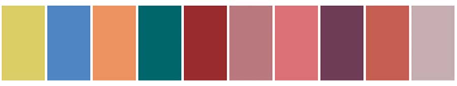
Pantone Palette
Introducing the Neutrals
Neutral colors can be just as beautiful as bold hues. What we love about good neutral colours is the natural element. They offer cozy vibes and bring a flow of ease to the space. If you love them, too, you might look at pairing some darker green hues with lighter tones. Or use them as your foundation while you bring in pops of color from this year’s colour palette. Mix and match, try some new colors. Pantone offers a variety to choose from that can elevate your space, no matter your color inspiration.

Pantone Palette – Neutral
All Natural Tones
Inspiration can be drawn from so many spaces. What better place to get colour inspiration than outdoors? The classic Pantone palette is all about looking to natural tones in woodsy hues, tan and green tones. Then, discover the vibrant accents that highlight the natural tones. The great outdoors await, and you can bring this influence into your home with fabric choices in solids, patterns and textures. Design your home with a breath of fresh air by introducing colours inspired by nature.
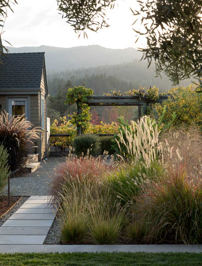
Natural Landscaping
Dynamic Dining
Get down to the business of relaxing with a beautifully crafted and designed dining room. When you sit down in the space, it will feel good to have a sense of connection, with time to just enjoy the experience. What can help with that experience is to make sure you have colours you love. Make it a conversation piece with accents and artwork that add memories and intrigue. This year’s palette is all about self-expression, and the dining room is the ideal place to create your own personal style.
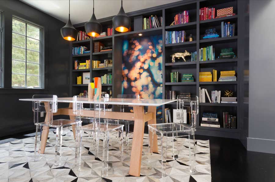
Dining Room
Kitchen Color Inspiration
After a long day, nothing feels better than walking into a fresh, clean kitchen. Whether it’s bright white or full of colour, you can design the way you experience dining and cooking in this space. From accent colors that highlight the look, to rooms colour-drenched in your favorite shade, this year’s palette is about making the space your own. We love this year’s Alexandrite makes a statement of colour in this kitchen. In addition, with the right window coverings, your kitchen can feel lightyears away from the stress of the outside world. Personal design allows you to create an environment that feels good for you and your family.
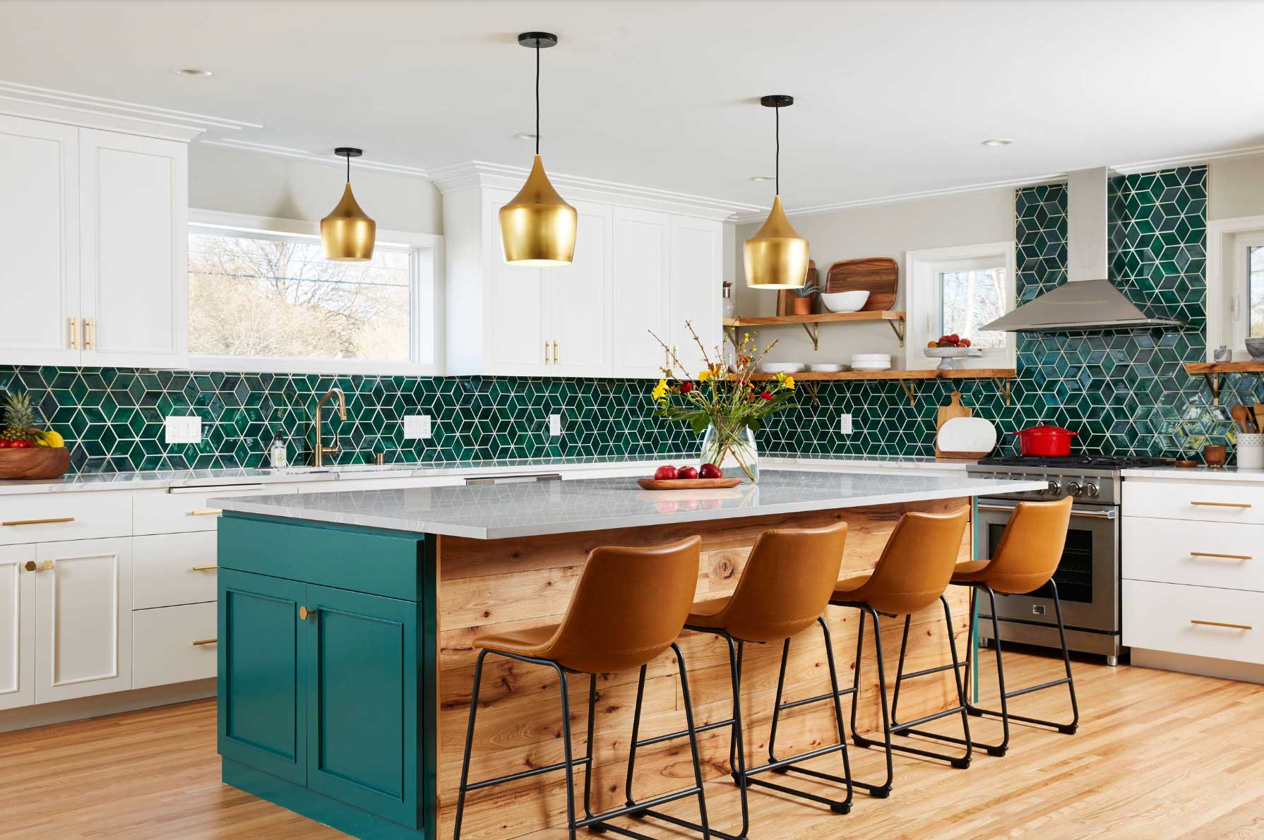
Pantone Palette – Kitchen
Bold Living Room Color
Entering your living room should feel like you’ve been transported to another space. The right colours can really enhance the atmosphere. This year’s colour inspiration offers passionate tones of pinks, purples and deep red–meant to create luxury and sophisticated warmth. No matter the look you are trying to achieve, from edgy and alluring, to cozy and comfortable, your living space should offer you the perfect spot to unwind after a long day.
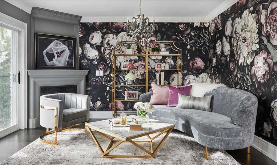
Living Room
A Bedroom Beyond
Think about your bedroom as a space for preserving all that you love in one place. Cozy, soft decor, lush bedding and beautifully crafted window coverings–all of these elements come together to create a calm, serene atmosphere. Whether you prefer bold, vibrant colours, or the peace and tranquility of cool colours, you are more likely to feel rested if you love the look of your bedroom. This year’s palette is all about helping you create the right personal space for yourself. Feel at one with your environment as you relax and enjoy the beautiful composition of colours you have chosen.
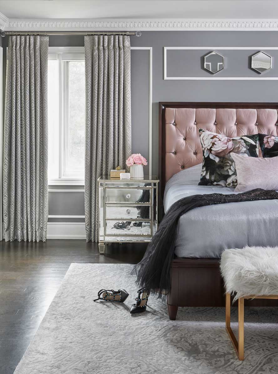
Bedroom
A Beautiful Bathroom
Home design is key to feeling a sense of ease in every room of your home. A well-designed bathroom is no exception! Pantone is pulling punches from their palette this season with gorgeous, deep hues and softer tones for a more muted, earthy look. Bathroom spaces tend to be smaller than other rooms in your home. But they do a hold a big place in your life. You deserve to visit your bathrooms throughout the day and enjoy the pop of design they provide. Pair accent colours and patterns together for a unique look that is all you. It’s the wow factor this room needs.
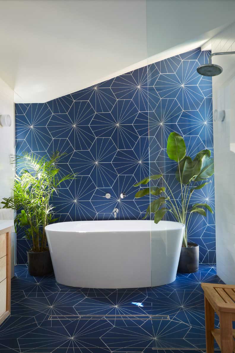
Bathroom
Let’s Get Started
Get ready for your next project by visiting one of our showrooms. We can show you the fabrics up close and let you see the texture and how the swatches interact with the light. Explore the operating systems and innovative features new window coverings have to offer. If it’s time to get started on your next project, we can also come right to your for a free in-home design consult. Contact us to schedule!